When it comes to home improvement and interior design, color is one of the most powerful tools at your disposal. The hues and shades you choose for your home don’t just make it look great – they can also significantly impact your emotions and the overall feel of your space. This fascinating intersection of art and science is known as color psychology, which explores how different colors influence human mood and behavior. By understanding color psychology, you can transform your living spaces to enhance your mood, productivity, and overall well-being.
Understanding Color Psychology
Color psychology is the study of how colors affect perceptions and behaviors. Different colors can evoke certain emotions in people. For example, warm colors might make you feel energized and passionate, while cool colors might calm you down and help you relax. Understanding the principles of color psychology can guide you in making informed decisions when it comes to your interior spaces.
Warm Colors: Energize and Stimulate
Warm colors include red, orange, and yellow. These hues are known for their ability to evoke feelings of warmth, comfort, and energy.
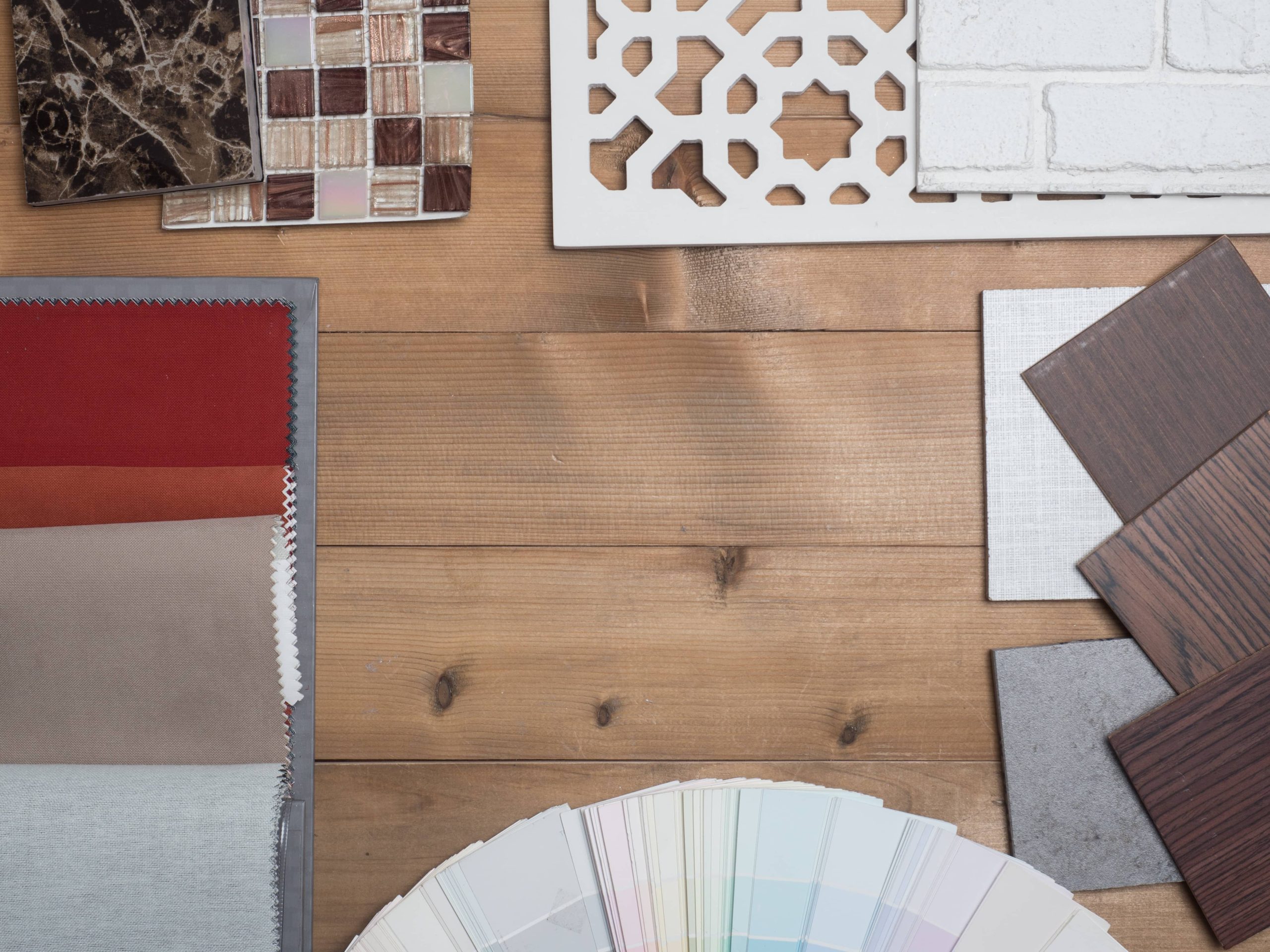
– Red: This color is known for its ability to increase energy levels, stimulate conversation, and even raise your heart rate. It’s an excellent choice for social spaces like living rooms and dining areas. However, use red sparingly in bedrooms, as it can be too stimulating for restful sleep.
– Orange: Orange evokes enthusiasm and excitement. It’s a welcoming color that encourages interaction and collaboration, making it perfect for home offices and workout spaces. The vibrant hue can inspire creativity and lively discussions.
– Yellow: Often associated with happiness and positivity, yellow can brighten up any space. It’s a great option for kitchens and dining areas, as it can stimulate appetites and encourage conviviality. However, too much yellow can be overwhelming, so it’s best used as an accent color.
Cool Colors: Calm and Rejuvenate
Cool colors like blue, green, and purple evoke feelings of calmness and tranquility, making them ideal for creating soothing retreats within your home.
– Blue: Known to reduce stress and encourage calmness, blue is ideal for bathrooms and bedrooms. Lighter shades can provide a sense of serenity, while darker shades bring sophistication and intimacy. Blue can be very versatile, aligning well with coastal or minimalistic interior styles.
– Green: Symbolizing nature and renewal, green is a balancing color that can bring harmony to any space. It’s especially well-suited for bedrooms and living rooms, creating a fresh and soothing atmosphere. Green connects well with biophilic design principles, often used to create environments that enhance physical and mental well-being.
– Purple: Often associated with luxury and creativity, purple can add depth and sophistication to a room. Whether in a deep plum or a soft lavender, purple is excellent for adding a touch of elegance to a living area or bedroom. Lighter shades can also bring a gentle touch of femininity and calm.
Neutral Colors: Flexibility and Balance
Neutral colors like white, gray, and beige may seem mundane at first glance, but they are crucial in creating balance and versatility in your interior design.
– White: Symbolic of purity and cleanliness, white can make spaces feel more spacious and open. It’s perfect for small rooms or spaces where you desire a fresh, airy feeling. White serves as a perfect backdrop to highlight colorful art pieces or furniture.
– Gray: Offering sophistication and elegance, gray is a neutral staple in modern design. It’s versatile and pairs well with almost any color to either tone down or highlight contrasting hues. Light gray can provide a sense of calm, while darker tones lend a more dramatic flair.
– Beige: As a warm neutral, beige brings a coziness that is inviting and soothing. It’s less stark than white, and can create warmth in a space without overpowering it.
Practical Tips for Using Color Psychology in Home Design
1. Consider Room Function: Before choosing a color, think about the purpose of the room. Is it a space for relaxation, work, or socialization? Your chosen colors should support the room’s function.
2. Start with a Neutral Base: Using neutral tones as the base for your palette allows for greater flexibility when incorporating accent colors. It also lets you refresh your space easily without needing a total overhaul.
3. Use Accent Colors Smartly: Accent colors can add personality without overwhelming the space. They can be incorporated through pillows, artworks, rugs, or side furniture pieces.
4. Consider Natural Light: The amount and quality of natural light in a room can affect how a color appears. Test paint samples on your walls and observe them in different lighting conditions throughout the day.
5. Scale Your Saturation: In smaller spaces, lighter colors can help create an illusion of space, while richer, deeper colors can make larger areas feel cozier.
6. Personal Preferences Matter: While color psychology provides a guideline, personal preferences should not be ignored. Choose colors that you and your family enjoy and feel comfortable with.
By strategically using color psychology in your home, you can create spaces that not only look beautiful but also enrich your psychological well-being. Whether you’re revamping a single room or your entire home, remember that the right color can set the perfect tone for every space in your home. Happy decorating!